Almirol_Portfolio_2nd_Semester
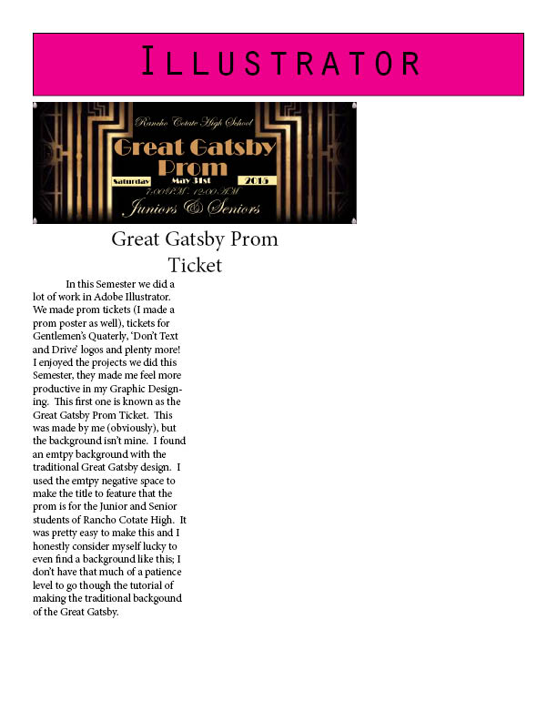
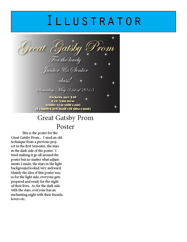
This week we were all working on our portfolios.  I had too many pages to post in so I’m just sending in my cover.  It’s almost like giving in a secret file to the government.

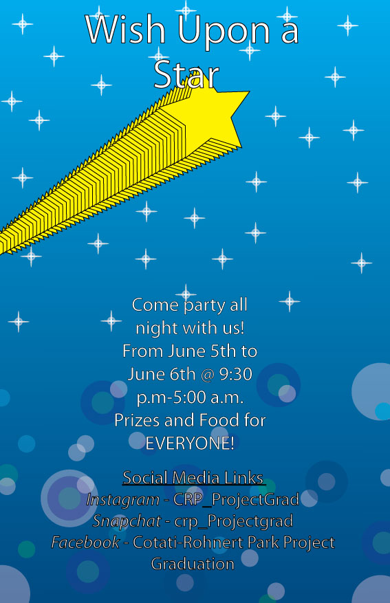
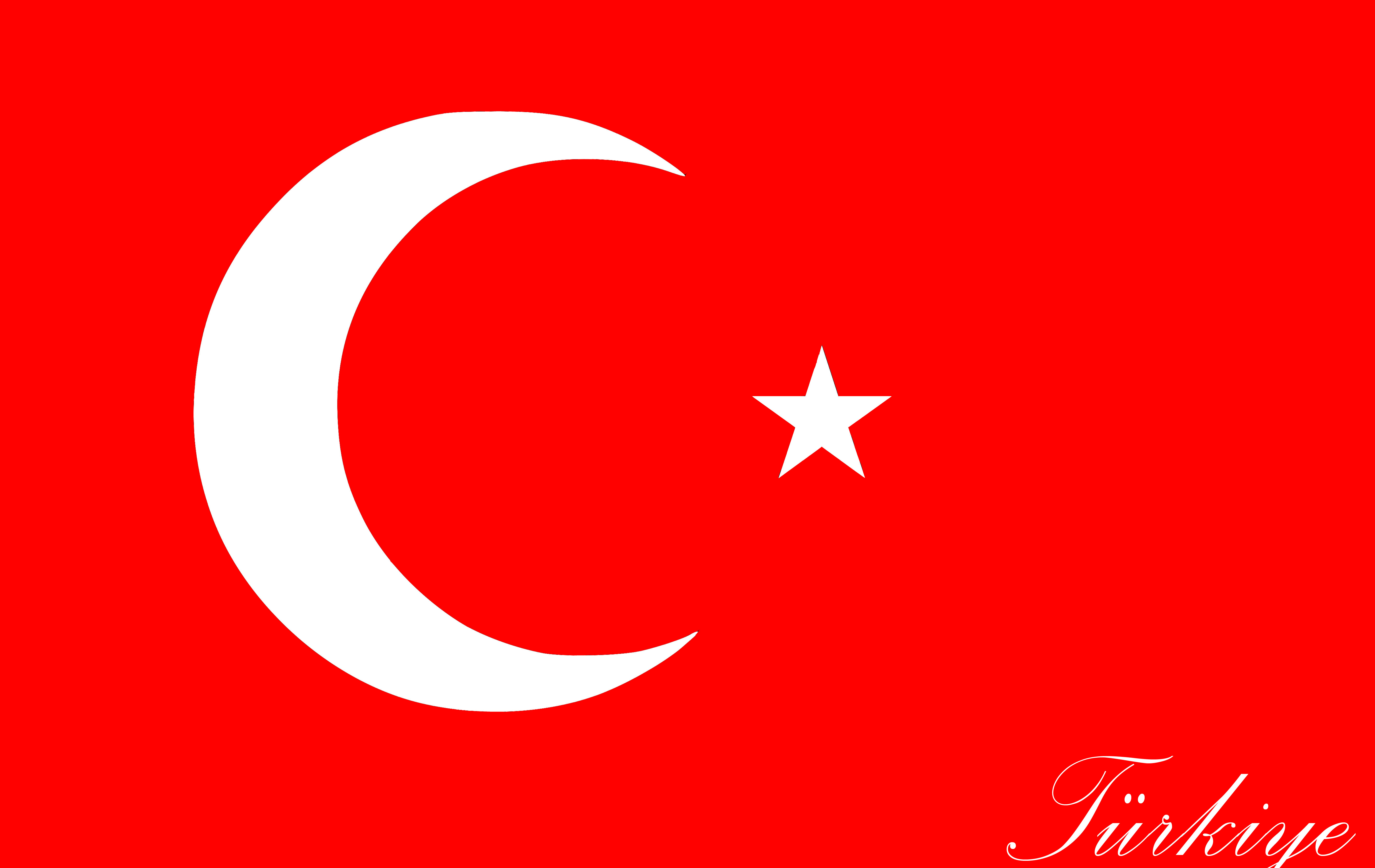
As you can see my cover has my first and last name with lower text saying “Graphic Design Portfolio” translated to Turkish first, then in English below that.  I had a fellow class mate let me borrow one of her bubble backgrounds for my cover.  At the time I didn’t know how she made that pattern until I made the Project Grad poster.  If you would like to learn how to do that design, you can go ahead and look at my last post with the Project Grad and the Dance poster.

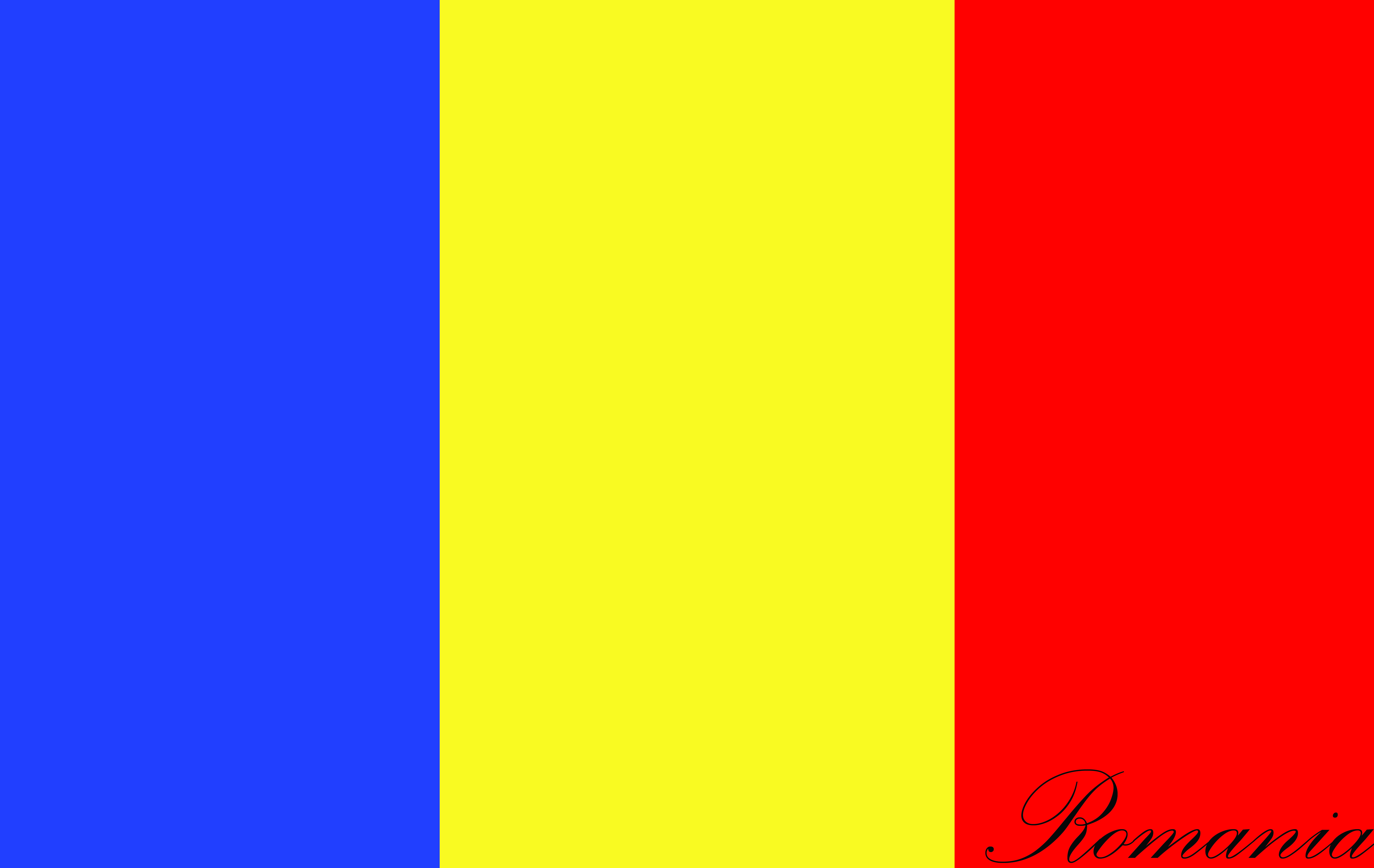
I chose the color red because I thought it would fit the theme of the colors of the Turkish flag.  Why the Turkish flag you ask?  Because I have a very high fondness of Turkey and it’s culture, I think the flag is very beautiful and red & white are some of my favorite colors.  I’m also learning Turkish so some things in my portfolio will translate to the language.  I hope you enjoyed this entry of the week ❤ !  Until next time, this is me signing off. 🙂

RCHS Dance and Project Grad

Dance-Graphic-rough-draft MA_Project_Grad

This week I’ve been mostly working on my portfolio, but I also had to get my things together and finish these projects.

(Left) RCHS dance logo.  I was pretty late to the game when I started working on this and I couldn’t think much to add to it.  Our school dance teacher wanted more things added to it, though all I could think of was to make the word ‘work’ more flashy.  I found a tutorial online to make the word look like it sparkles and glitters, I could have added color to it but I was pressed for time…  Though I think it looks pretty good just gray~.  Obviously not something she expected or would accept but it was by far the best I could some up with.  I could have added another silhouette, but I only had so much space to work with…  I probably should have given myself more time to work on this; as well as the Project Grad poster (right).

Project Grad.  This was supposed to be an invitation for the Seniors in the CRPUSD.  To have and eight hour night of their lives!  Considering this was supposed to be the best we could come up with, I felt like I’ve done a pretty good job.  Though I know this one is definitely not going to be the one that’s going to be posted around the high schools of CRPUSD…  Oh well, I’m pleased with the results and I hope my teacher is as well.  I used an old technique I learned (I’ve used them in other previous projects as well), the stars on the top of the poster.  The bubbles at the bottom I learned from a fellow classmate.  Instead of using the Screen Transparency setting I would just fill the ellipse with a color of my choice and lower the opacity of the color.  If you would like to use this technique just take a note and make sure that the ellipse does NOT have a stroke with it. 🙂

RCHS Dance Program (Adobe Illustrator)

Dance-Graphic-rough-draft

Today I worked on this project for our school’s dance team.  It’s awfully too simple in my opinion but I finally got the chance to work on it today and, it’s okay for starters.

At first everyone was given a link to save the silhouette and work on it along with adding more pizzaz to the caption.  I nearly did the whole thing over but with the person having a drop shadow and the ‘Work’ text looking like it has glitter on it.

My creativity has been lagging for a while…

Semester Portfolio Rough Draft and ext. Adobe After Effects

Almirol_Portfolio_2nd_Semester2 Almirol_Portfolio_2nd_Semester3 Almirol_Portfolio_2nd_Semester4 This week I mostly worked on my semester portfolio.  At the moment I only have three projects on it, one of them wasn’t an assignment.  As you can see, there’s my personal art creation of the lady on the Photoshop category… My graphic design teacher allowed me to put it in because he basically claims that it shows that I have an individual interest in my training to work on my own art work and use the techniques he taught me to make the image/project have more pizzaz~.  I also worked on many other things like in Adobe Illustrator to make a flower and open it up in Adobe After Effects to animate it (just learned how to use that new app). I had a hard time on it for the past couple of days until I received some help from a fellow student and now I have it like i know that back of my hand (almost).

LJMS-Athletes of the Year

LJ-Athletes  This week we were assigned to start a project on making a poster for the middle school, known as Lawrence E. Jones, it’s supposed to represent the athletic school records of the year in each sport.  Since there wasn’t anything really like this, instead of the little flags that go all the way back to 1992 (or earlier), the staff wanted the high school’s graphic designers to make a “Hall/Wall of Fame” for the students who have achieved school records in their particular sport.

Making this was pretty quick and easy, I didn’t want it to look too flashy though…  Despite the Gradient of the text boxes (that have no text; yet) and the filled in letter’s with enclosed empty white space, I think I made it rather simple and clear.  i used the paint blob brush to make the border enclosing all the text boxes.  I believe I should have only had two rows of boxes counting from 2012 through 2015, because the years of before that was already posted on those little flags hanging on the walls of the gym.  Overall I’m pleased, so far, with the results.

This week was a rather unproductive week for me…  Despite the fact that we started new things in our class, for example we logged into a GAFE account for our class and looked at Prom and GQ tickets. I would’ve made a lot of things in Adobe Illustrator but I was too lazy throughout the week to follow any of the directions on the tutorials, that and I was just failing throughout the whole process of the tutorials….  I don’t have a legitimate image to show you all for this week but maybe I could just slap on a photo for you~ something I probably tried to make…

IMG_5651


This image I actually drew myself a while back this year, and I colored her in Photoshop.  She’s supposed to be a personification of a city in Greece known as Athens (her original name).  Her human name is Tresa or Talia, I haven’t truly decided yet… (even after two or three months…)  She’s supposed to be the daughter of Greece and Nyo! Spain.  (Most of you probably don’t know what I am talking about, it’s from an anime I watch called Hetalia)  I have to do more research on Athens in order to fully take her into action.  Many people complain about OC’s (Original {Fanmade} Character) and how they’re underdeveloped in personality and such, so I’m trying to make a ‘good’ OC…  Anyways; this is pretty much what I can show you this week.  Hopefully the week after next week things will be done well on my part in my class and I’ll actually have something that’s related to the class to post for all of you to see.  Anyways have a good weekend and Spring Break! I know I will! 😀

Belgian Flag Czech Republic Flag Danish Flag Romanian Flag Russian Flag Seychelles Flag Turkish Flag Ukrainian Flag

This week I had really not much to do so I decided to do my own little project and make copies of European flags.  (Something I’m using for spacers in my Instagram account) As you can see I have made the Belgian, Czech Republic, Danish, Romanian, Russian, Seychelles, Turkish and Ukrainian flags.  I didn’t get to do the Hungarian flag yet because I was side tracked with other extracurricular work. (My Graphic Design director recommends I use Adobe Illustrator more, especially if I’m going to make these flags. {All done in Photoshop}) I might as well start using Illustrator for this project, it can help me make it look more HD and shiny~! I like shiny things… Well I’m a girl, so what do you expect? Haha, anyways… This was my project for the week and I hope enjoy the beauty of them! Thanks for reading and you all have yourself a great weekend! ❤

Gentlemen’s Quarterly (Ticket)

Gentlemens-Quarterly-TicketLast week and somewhat of this week, we were working on making a ticket for our school’s gentlemen’s quarterly.  For the most part of the making of this project I was absent and I only got a glimpse on how the ticket should traditionally look like; this was the best I could come up with… Hopefully it looks good but i know it’s probably not good enough to print out as an official ticket for our school’s fundraiser. ^_^”

I made this image in Adobe Illustrator, using the Gradient, Text, Line and Rectangle tools.  Very simple and easy to make…

RCHS Cheerleading Tryouts (Poster)

MA_RCHS_Cheer_Tryout_PosterThis week we were supposed to remake a poster that was originally designed by a cheerleader, for our school’s cheer leading tryouts.  The picture shown above is my remake, it looks pretty similar to the original (if only you can see it…) but mine has more organized alignment and spacing.  Hopefully my Graphic Design director would agree.  I felt pretty good about my work on this project; it was quite enjoyable to make, the photos kind of make a good eye-flow and the information isn’t too spaced out or crowded.  I would have to say it came out pretty nicely, if I do say so myself….  This project was made in Adobe InDesign. 🙂

Great Gatsby Prom

Great-Gatsby-Prom-Poster Great-Gatsby-Prom-Ticket This week’s project was about designing a prom ticket for our school and make it have a theme from the Great Gatsby.  I personally enjoyed this project but at the same time I felt like it went a lot faster than I expected it to be…

It wasn’t too hard to do anyways.  On the top one, I decided to make a poster (that was actually made AFTER the prom ticket).  Yet again I used Adobe Illustrator instead of Photoshop (that’s more required now since Photoshop makes everything pix-elated and hard to see sometimes).

So the way I made the poster I covered the art-board with a black background, using the rectangle tool.  Then using the gradient tool to make it have a shine/fade. To make things pretty fancy I used ‘fun’ fonts to make the title and information as seen on the poster as well with the ticket.  It still felt a little incomplete so I decided to use a little technique I learned in one of my previous projects.  Can you guess what it is?  Hint: It was one of my least favorite projects so far from this year (or last year).

I decided to make the diamond star that I learned to make in that last particular project.  Notice how I only put it on the dark side of the poster; well the star looked very awkward on the bright side. I tried making adjustments to it to make a star go on that side but it looked even more awkward so I just had to wing it from there.  I believe I did a pretty good job but who am I to judge really?  I just feel good about it.  Oh! And I also used the symbol spray tool to plant the diamonds on the poster and ticket.  I hoped you enjoyed my new post presentation and stick around to see more new posts. Bye and Happy Friday!