 This week’s project was about designing a prom ticket for our school and make it have a theme from the Great Gatsby. I personally enjoyed this project but at the same time I felt like it went a lot faster than I expected it to be…
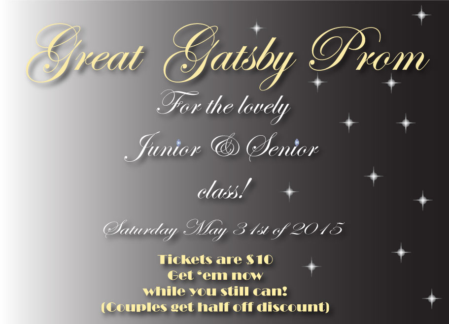
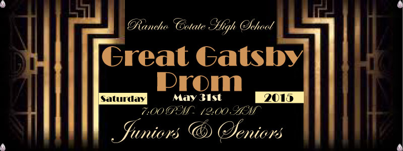
It wasn’t too hard to do anyways. On the top one, I decided to make a poster (that was actually made AFTER the prom ticket). Yet again I used Adobe Illustrator instead of Photoshop (that’s more required now since Photoshop makes everything pix-elated and hard to see sometimes).
So the way I made the poster I covered the art-board with a black background, using the rectangle tool. Then using the gradient tool to make it have a shine/fade. To make things pretty fancy I used ‘fun’ fonts to make the title and information as seen on the poster as well with the ticket. It still felt a little incomplete so I decided to use a little technique I learned in one of my previous projects. Can you guess what it is? Hint: It was one of my least favorite projects so far from this year (or last year).
I decided to make the diamond star that I learned to make in that last particular project. Notice how I only put it on the dark side of the poster; well the star looked very awkward on the bright side. I tried making adjustments to it to make a star go on that side but it looked even more awkward so I just had to wing it from there. I believe I did a pretty good job but who am I to judge really? I just feel good about it. Oh! And I also used the symbol spray tool to plant the diamonds on the poster and ticket. I hoped you enjoyed my new post presentation and stick around to see more new posts. Bye and Happy Friday!
